Sprint 2 - Technical - Fixed, Relative and Absolute
Fixed
A fixed element is positioned relative to the viewport or the browser windows itself -not the underlying webpage. No matter if you scroll up and down the element will stay fixed to the window not the underlying grid.
Absolute
This type of positioning gives web developers 100% control. You can display the element exactly where you want it on the webpage. You can use the attributes such as: top, left, bottom, down and right to set its location
Absolute positioning is inherited from the next parent element. If the child sits inside a parent element it will move inside that box. If no such parent exists then it will position relative to the underlying html.
The most important thing to remember about absolute positing is that these elements are removed from the flow and do not and are not affected by other elements on the page. This is a serious thing to consider every time you use absolute positioning. Its overuse or improper use can limit the flexibility of your site
Relative(to iself)
This is rather confusing. If you set position: relative; on an element but no other positioning attributes (top, left, bottom or right), it will have no effect on it’s positioning at all.
If you do give it some other positioning attribute, say, top: 100px right:100px, it will shift its position 100 pixels down and 100px left from where it would normally be on the webpage.

The first this you need to know to understand positioning of elements inside a webpage is that element acts like a block inside a grid
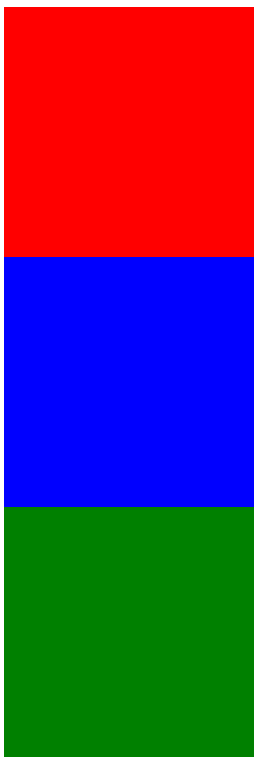
By default, div elements are set to display: block this means if you give them height/width properties and create a rectangle/square. Multiple div elements will inherently stack one on top of the next, vertically

This contrasts with span elements which are by default set to display: inline-block. Now we can imagen that our blocks are waiting inline at the grocery store waiting to be served.

But how do we know where these blocks will appear on the screen? Will they be in the center, top-left, top-right or perhaps at the bottom of the page.
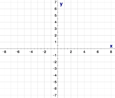
Remember the we said webpages are just like blocks displayed on a gird?

That grid like a piece of paper from your highschool maths book. Now lets imagen you got kicked outside the classroom for being disruptive and your friend has drawn a funny picture on your book, they then showed you this picture through the window while you stand outside.
That window is your viewport and your math book is our webpage.